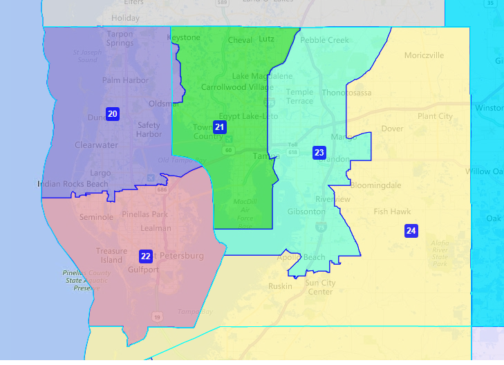
One major point of contention during the first week of the Special Session to redraw the Florida Senate seats has been the Tampa Bay area.
Many spectators expected the Florida Senate to abandon efforts to cross the Tampa Bay from Pinellas to Hillsborough County, which they did in two districts in 2012.
You can see this in the map below.
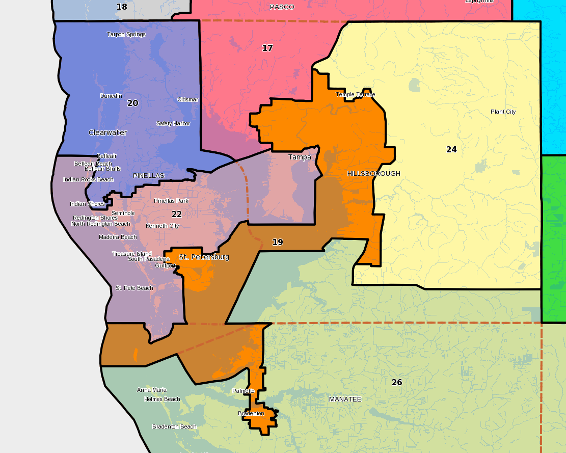
The 19th district was used to create an African-American seat in the Tampa Bay region. Meanwhile, the 22nd district combined white Pinellas voters with those in part of Tampa.
The League of Women voters cited problems with both districts, arguing the 22nd has no legitimate reason to cross the bay and that the 19th overly packed African-American and Hispanic voters to protect surrounding Republican Senators.
When the Florida Senate came into Special Session, they had six base maps drawn by staff ready to go. In 3 of the 6 plans, the central Pinellas seat still crossed the bay while the African-American seat no longer went to Manatee County; but still crossed open water into Pinellas.
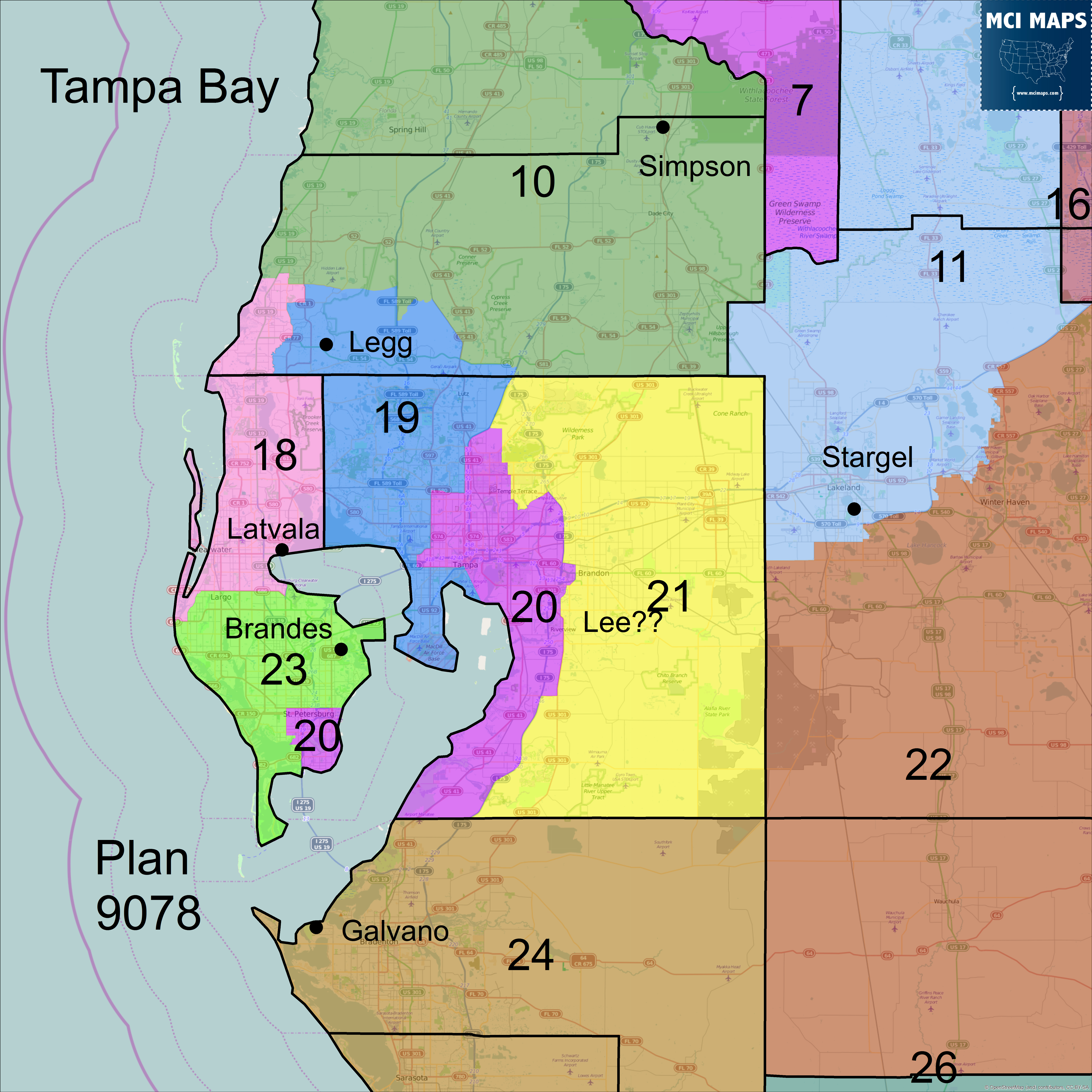
The reason staff gave for the African-American district crossing the bay is that going into Pinellas is needed to create a minority district in the region. The map that Bill Galvano chose to push forward with, plan 9078, has the African-American district cross the Tampa Bay. Meanwhile, the central Pinellas district will not.
In order to determine if a district is a minority district, the legislative staff goes through two processes. First, it determines which party controls the district. Then it determines the demographic makeup of the primary for the controlling party. This district and any variation would be heavily Democratic. According to the data from the legislature, 52.5% of the 2010 Democratic primary was African-American. If you try to create a district just in Hillsborough, there is no realistic way to create a district over 50% African-American in the 2010 Primary. However, at this point the 2010 data is very outdated and hides the truth about the Tampa Bay region and the ability to create an African-American seat in Hillsborough County.
The Problem with the Data
During the first few days of this redistricting session, Senators from both sides of the aisle grilled the redistricting staff on why their primary data only went to 2010. The data had been updated to include 2012 General Election data heading into 2014’s summer redistricting process, but not primary data, the key item used for determining minority districts. The argument was that it would take months to do, which frankly is not true. Getting the data sorted by precinct would take, maybe, days with multiple people on it (if not less) while getting the data down to a census block level would take longer, but certainty not months. This process could have been tied into the time when 2012 General Election data was being added last year, but it was not. Again, the legislature is not saying they must use 2010 data for determining minority seats, they are simply saying that doing so would take time and effort and apparently wasn’t worth it.
Using precinct-level 2012 data I was able to look at the newly proposed African-American district, numbered the 20th in the original plan Galvano’s selected (but may be renumbered to the 19th) and compare it to other proposals as well.
Comparing the Plans
Under Galvano’s map, the African-American share of the 2010 Primary for the district was 52.5%. In 2012 that number rises to 55.5%; with Hispanics at 5.9% and whites at 36.5%. A vast majority of that African-American rise is thanks to African-American registration/turnout increases in Hillsborough. The chart below shows the African-American share of the primary by year and by county.
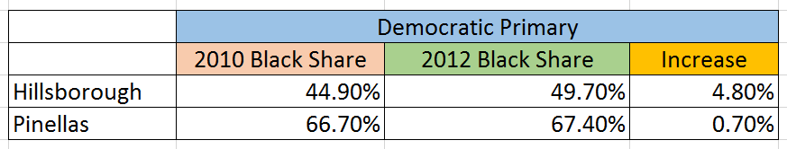
The large jump in Hillsborough is largely thanks to major registration efforts by the Obama campaign in the 2012 cycle. The campaign’s goal was to register new voters to shift the Demographics of the electorate in key swing states. Newly registered voters are more likely to vote than those registered for years. Their registration has permanently shifted the electorate of the area. Hillsborough became much more diverse than Pinellas, hence its primary became more diverse.
This shift in demographics, specifically in Hillsborough, is a major point of contention when discussing redistricting in 2015. The legislature is using outdated data that was compiled before huge spikes in non-white voters in counties like Hillsborough.
Let’s look at an alternate proposal for the region. Republican House member Matt Caldwell proposed his own redistricting plan just a few days ago. His plan has the city of Tampa only split twice, versus being split 3 times in Galvano’s chosen map.
The 23rd district is the interesting one here. The district is posted as 43.35% African-American in the 2010 primary. However, as I have demonstrated, 2010 was before major registration shifts in the county. Under the 2012 primary, the African-American share just reaches 50.3%.
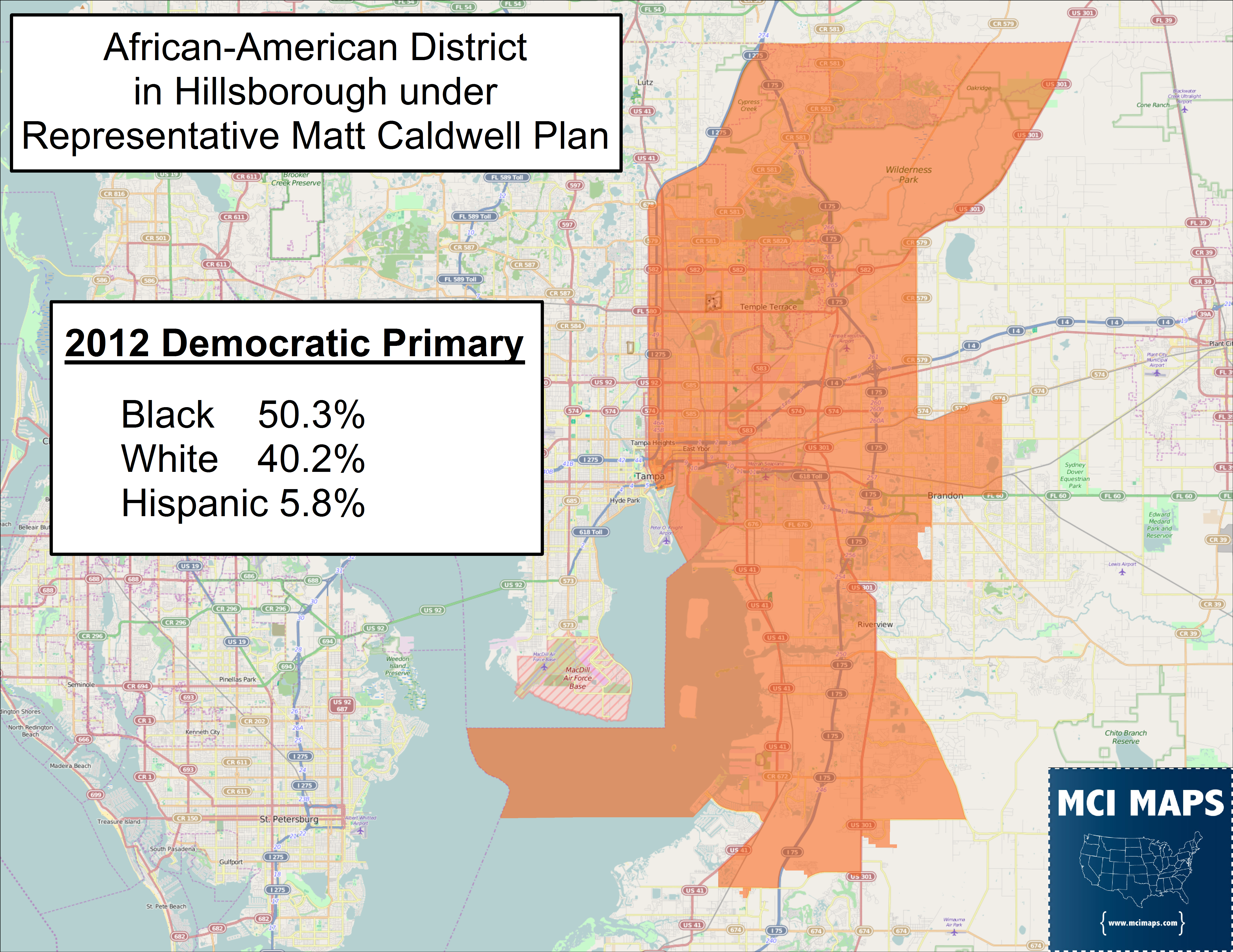
An important technical note: my 2012 data is at the precinct level and as this plan and others split precincts, my racial shares are estimates based on split precincts. The final numbers could shift by a few tenths of a percent. So keep that in mind.
The gap between African-American and white voters in this plan is 10%, meaning African-Americans still control the primary.
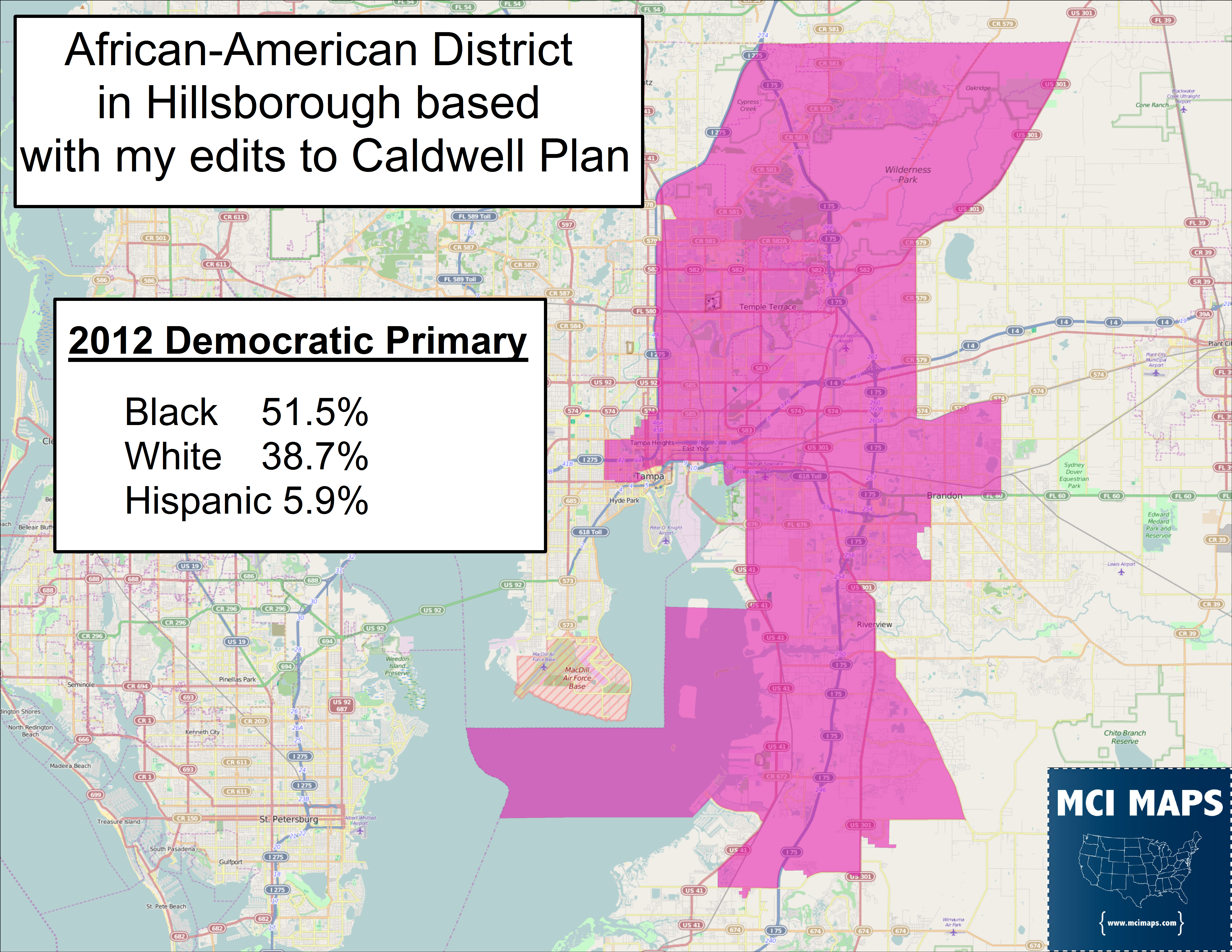
I went ahead and made some slight boundary changes to Caldwell’s map, moving the borders of the 23rd and 21st to grab additional African-American voters. Doing this, I was able to move the African-American share to around 51.5%.

The gap between black and white shares of the primary is now 12.8%, further cementing African-American control of the primary.
The question we have to ask is this: does crossing the bay to get that African-American share from 51.5% to 55.5% really justify going over open water?
Using water connectors that aren’t for islands is a very dicey process and should be reserved for situations that are absolutely necessary. For the last twenty years, this process was needed to create the African-American district for Tampa. Today, it is not. The excuse given by the legislature is that you can’t create a seat over 50% African-American in the primary within just Hillsborough. This is conveniently true thanks to the legislature, which has wasted millions of taxpayer dollars fighting for its districts in court, but was not willing to pay staff to update new data. I don’t blame staff for the old data, I blame their bosses; the lawmakers. I am not the first one to suspect that using old data is what the legislature wants. It is not hard to see that the African-American share of the electorate grew between 2010 and 2012. County-level data, readily available on the Florida Elections website, shows that 12,000 additional African-American Democrats joined the voter rolls in Hillsborough in those two years while white Democrats were actually reduced by 1,000.
By using 2010 data, it’s easy to say that the district must cross to Pinellas, keeping African-American voters that Republican Senator Jeff Brandes would be forced to take in otherwise. Brandes already sits in a swing seat split nearly even between the parties. This map shows the Charlie Crist percentage by precinct in 2014 and the Galvano map’s Senate lines.
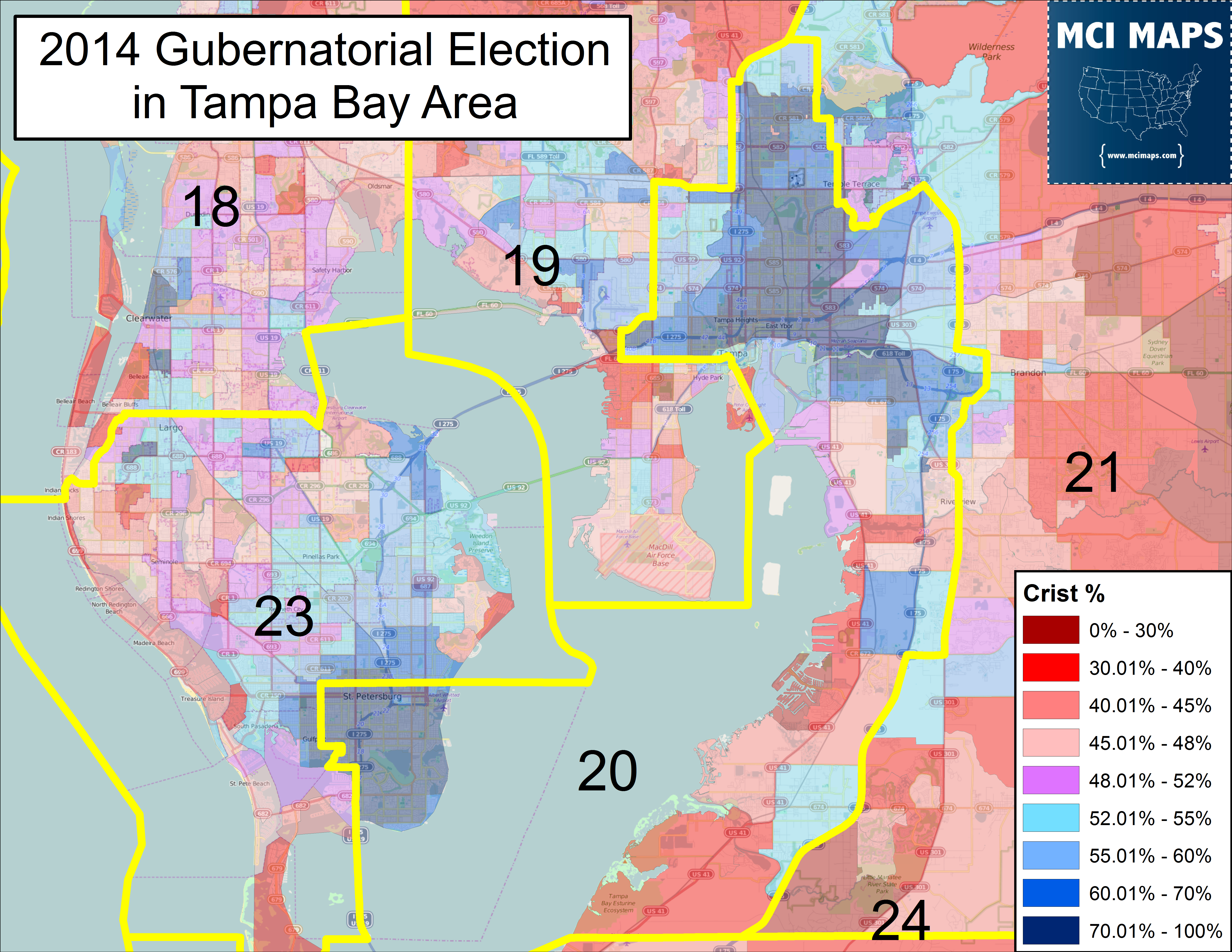
District 20 cuts off nearly all of the most Democratic precincts in Pinellas County. If Brandes had to take these voters in, he’d have to work much harder at re-election. I cannot help but believe this is the exact intent of the Legislature, to protect Brandes under the guise of ensuring racial voting strength. Again, the difference in African-American share of a Tampa Bay district is 55-56% to 51-52% depending on if you cross the bay. Both proposals will allow African-Americans to pick a member of their choosing, but one happens to also protect a powerful Republican Senator.
Maybe I am wrong and that intent is not there. Perhaps there is a debate to be had on 51% versus 54% and if that difference is worth crossing open water. We should have this debate. However, with the legislature using old data, the debate is not being had and I fear it never will be. There is a big difference between using 2010 data which has Caldwell’s plan at 43% African-American in the primary versus 50% when citing 2012 data. I would agree 43% would be just too low. However, 50.3%, or my proposal where its 51.5%, versus Galvano’s 55.5%, is a worthy debate. Unfortunately, using old data we may not get the debate we deserve. Again, I can’t help but think how convenient this is, especially for one Republican State Senator.
4 thoughts on “Updated Data Shows State Senate Districts Shouldn’t Cross the Tampa Bay”
Comments are closed.