
The Season 4 finale of the hit HBO show, Veep, saw President Selina Meyer learn her fate as she sought to get elected to a full term as President. The electoral map that resulted from the episode was a little odd for anyone who follows Presidential politics. States were won by parties you would never expect to see in real life. The whole episode got me thinking about the times we saw election results in TV shows that just did not fit in line with reality. Moments that make people like me get angry with nerd rage.
Hence I have decided to do a post on the odd electoral maps we have seen in big hit TV shows. The question for me is, why do these maps have to be so unrealistic?
Veep
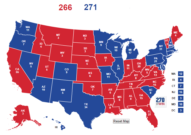
Lets start off with the most recent offender, Veep. In the finale, Meyer was facing off against a presumably-Republican US Senator in what was considered a tight race. While Meyer is never officially identified as a Democrat, her agenda throughout the series indicates she leans left of center. As the finale begins, state’s start getting called. A close observation of the episode gives us a good idea of which states were called for which candidate. Some states calls like Pennsylvania, Colorado, or Vermont are uttered by cast members, while views of the electoral map on the TVs help fill in the other gaps. The episode ends with the electoral college in a direct tie. Based on the calls made in the show and the maps seen on the TVs, this is the most likely electoral map for Meyer.
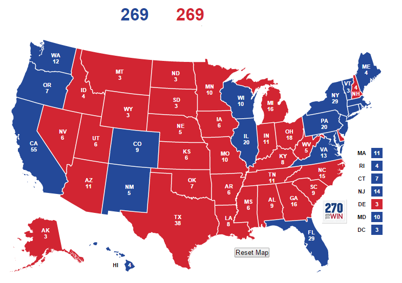
Anyone who follows Presidential politics can see some problems with this map. Minnesota is red for the first time since 1972. Delaware is red for the first time since 1988. Meyer is also losing notably Democratic states like Nevada and Michigan, yet winning key swing states like Colorado, Florida and Virginia. A scenario where Delaware and Minnesota go red is indicative of a Republican landslide in our modern political world. Florida going blue also seems unlikely since Amy, Selina’s old campaign manager, sings that turnout is low in Broward County, a huge Democratic base of votes for any Democrat running in the state. Low Broward turnout tends to mean Florida going red.
If the writers wanted to have a tied election, there was a much more plausible map. Meyer could have lost much of the Midwest but retained other swing and Democratic states.
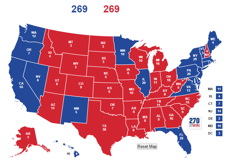
In this scenario, Meyer loses most of the rust belt and the farmland areas thanks to dips in support from the heavily white population in those areas. However, Meyer wins Florida and Virginia due to heavy GOTV efforts with Florida’s minority population and in Virginia’s Northern suburbs. Virginia is continuing to become more Democratic as its population shifts and Florida often comes down to turnout in key Democratic counties. Minnesota and Delaware go back to blue and the map reflects something a but more in line with reality.
The West Wing
Veep isn’t the only show with odd electoral maps. The West Wing was a great offender on this front as well. While only one election in the show featured an official electoral map (the 2006 race), from conversation of characters, its possible to recreate the electoral maps of Bartlet’s two elections.
First is the 1998 election that Bartlet won to become President. This happens a year before the show begins. From conversations between characters, we know Bartlet got 48% of the vote, but got more votes than an unnamed Republican opponent. Bartlet also got 303 electoral votes. Different conversations and quips note that Bartlet won states like Indiana, but lost states like Maine. It is also implied Bartlet won Georgia and Montana. Most other state’s mentioned are fairly normal. However, to get to 303 votes based on the states mentioned, the map looks something like this.
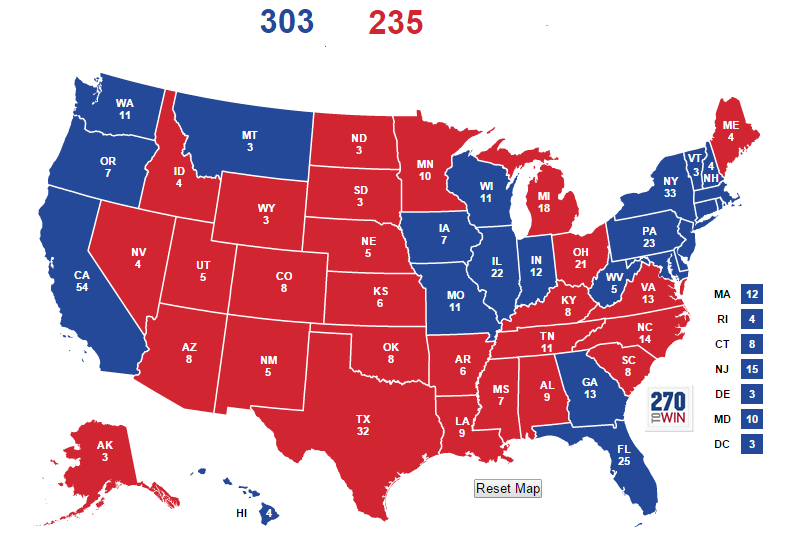
Its hard to see a universe where Bartlet loses Minnesota (similar to Veep) but wins Florida, Georgia, Indiana and Montana. Bartlet losing Maine also seems to be because they don’t seem to like him very much, by his own admission. Bartlet is implied to have won Indiana thanks to the Democratic Governor’s campaigning for him, while Hoynes delivered Georgia, West Virginia, and probably Florida. I tried creating a map with blue Minnesota but could not get to 303 based of states staying they way they were called in the show. This map is the most subject to speculation. However, other fans have come up with the exact same map (you can find discussions of it online).
While the 1998 map has issues, the 2002 map gets even weirder. Bartlet wins re-election thanks to crushing his opponent, the Governor of Florida Robert Ritchie, in the one debate of the election. Bartlet’s close re-election turns into a blowout following the debate and he wins by a 55% to 44% margin. The episode following the polls closing sees characters rattling off the different states’s Bartlet is winning, mostly focusing on red states they never expected to carry. Based on the states mentioned, this appears to be the most likely electoral map.
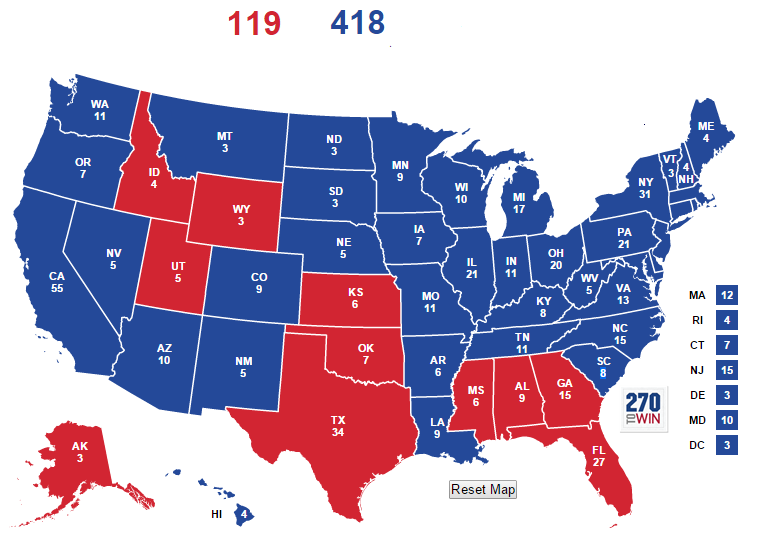
There is some variation to this, but the consensus appears to be a 39 state win. Bartet is said to have swept the plains states, the Great Lake States, won much of the upper south, won Louisiana, and presumably won every swing state. For no logical reason, New Hampshire, Bartlet’s home state, is close. Despite the big win, Bartlet losses the deep south and Texas (his VPs home state). It is possible the map is different, but Bartlet sweeping the plain states (including Nebraska and the Dakotas, as well as winning the states travelling down the Mississippi river) is cannon. The map honestly seems too blue for a 9% win. When Clinton beat Dole by 9% in 1996, he did not win the plains states, which are heavily Republican (Montana is a bit less red). Indiana is also much more blue in the West Wing universe than in real life, despite Toby Ziegler once commenting that Indiana would vote for any Republican.
One key piece of continuity issues occurs during the 2006 election when it is commented that North Dakota hasn’t voted Democrat in 40 years. Yet in season 4 it is expressly states Bartlet won by the Dakotas.
The last West Wing map is the 2006 election that saw Democrat Matt Santos beat Arnold Vinick in a narrow election. The map comes directly from the show, making it the least disputable map in this article. However, the map still has some very odd results.
So lets address California and Texas first. In the show, Arnold Vinick is the Republican Senator from California. He is pro-choice, socially moderate, pro-environment, and fiscally conservative. He is by far the most liberal Republican to run for President and have the nomination since Teddy Roosevelt. Matt Santos is the young, energetic Congressman from Texas. Vinick’s liberalism and personality originally make the election his to lose and he has a commanding leading the electoral college. However, a near meltdown of a nuclear plant in California (and Vinick’s support for nuclear power and his push for the plant to be opened decades back) make the race a tie. Vinick still wins his home state of California narrowly. It is implied he would have dominated it without the incident. This is questionable on its face. Even if a Republican Senator existed in California, the states blue lean would still make it close from day one. Unlike Governors, Senators are less know and it is questionable that Vinick had such a death-grip on the state. Santos, meanwhile, wins Texas despite only representing a blue district out of Houston. Texas didn’t vote blue in Bartlet’s blowout, I question it voting blue now.
In addition, Vinick wins Iowa despite coming out against ethenol subsidies during the primaries. Vinick also wins Vermont and Maine. Maine is onr thing, but Vermont, I don’t care how liberal Vinick is, seems unlikely. Meanwhile, Santos still wins New Hampshire while losing Vermont, an odd result. The weirdest result is Santos wins South Carolina for no real reason other than the state having a Democratic Governor. Santos loses Florida because Latino’s aren’t showing up like expected, which does seem unlikely with the first Latino Presidential Candidate and the campaign’s focus on the state. The electoral map for 2006 has many issues besides just California and Texas.
Conclusion
These are the most prime examples of electoral maps being used in major political TV shows. It is strange to see shows with such a political bent and attracting political audiences using election results. These are the shows were a higher percentage of the audience would be able to look at the map and call BS right off the bat. One can’t help but wonder if the maps are specifically meant to troll the more political side of the audience. If so, then I tip my hat to them. After all, they got me to write this article.